Words Hoard & Heath
Photography Diana ✨, Dagmara Dombrovska and Tom Swinnen
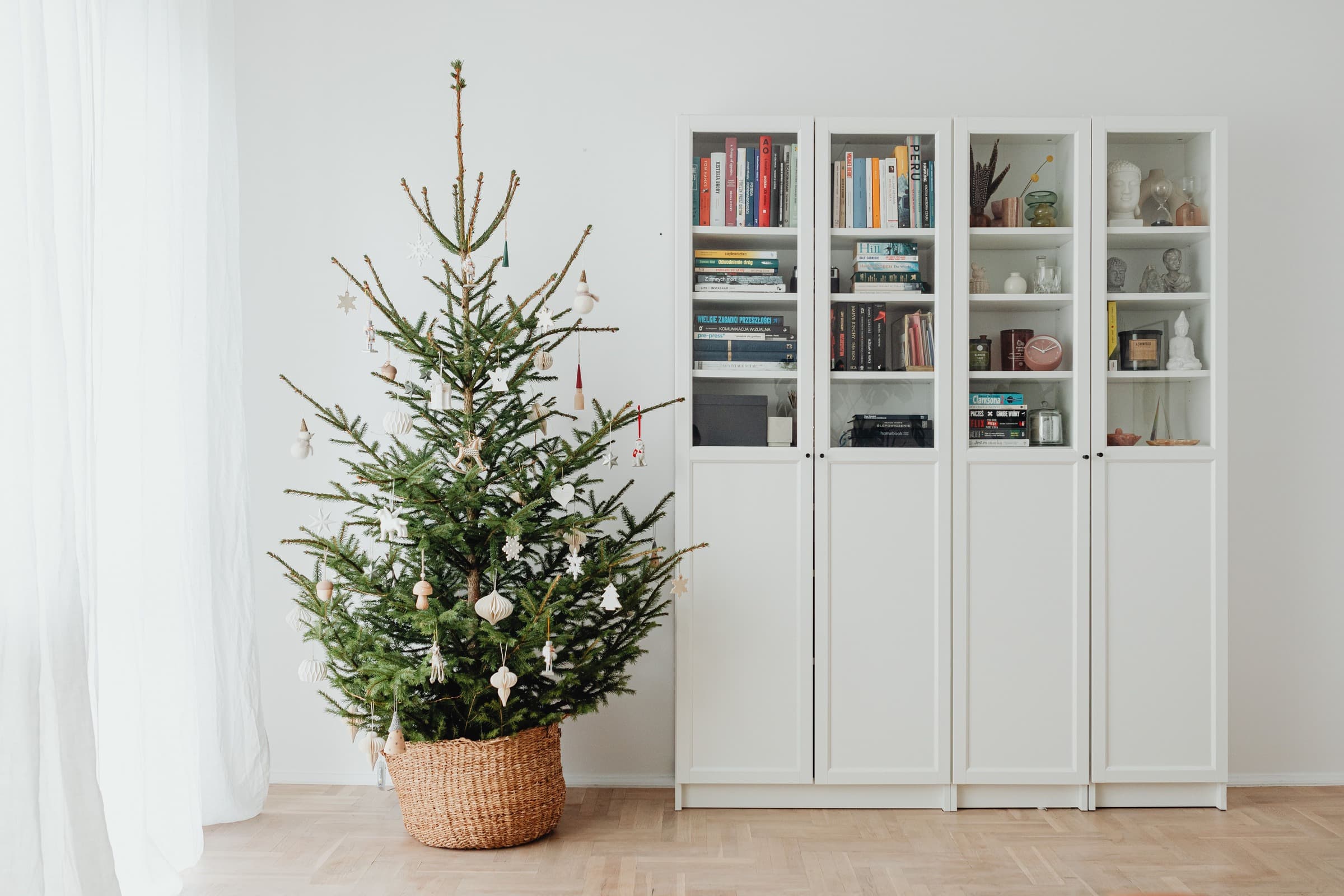
The white bauble in Diana’s photograph has a patch of darkness to itself. Its pale circle stays clear against the green branches. We would keep that gap around the white ornament before adding anything beside it.
Choose the decorations you most want to notice before filling the branches. Try one in place, then step back to where you normally see the tree. A detail that looks crisp in your hand may disappear at that distance.

Colour and surface
Glittered blue and gold-coloured balls sit beside red-and-white curves and mirror-like surfaces in Dagmara Dombrovska’s photograph. The round shapes repeat, but the finishes do different things. Try a few of your own ornaments together, then against the tree. Notice which pattern or finish you can still see.
We would keep the red-and-white and green-and-white balls together. Their curved bands repeat across two colours, connecting the group without making every bauble identical. A plain red or green one can sit alongside; the glittered blue makes a stronger interruption.
Space between the ornaments
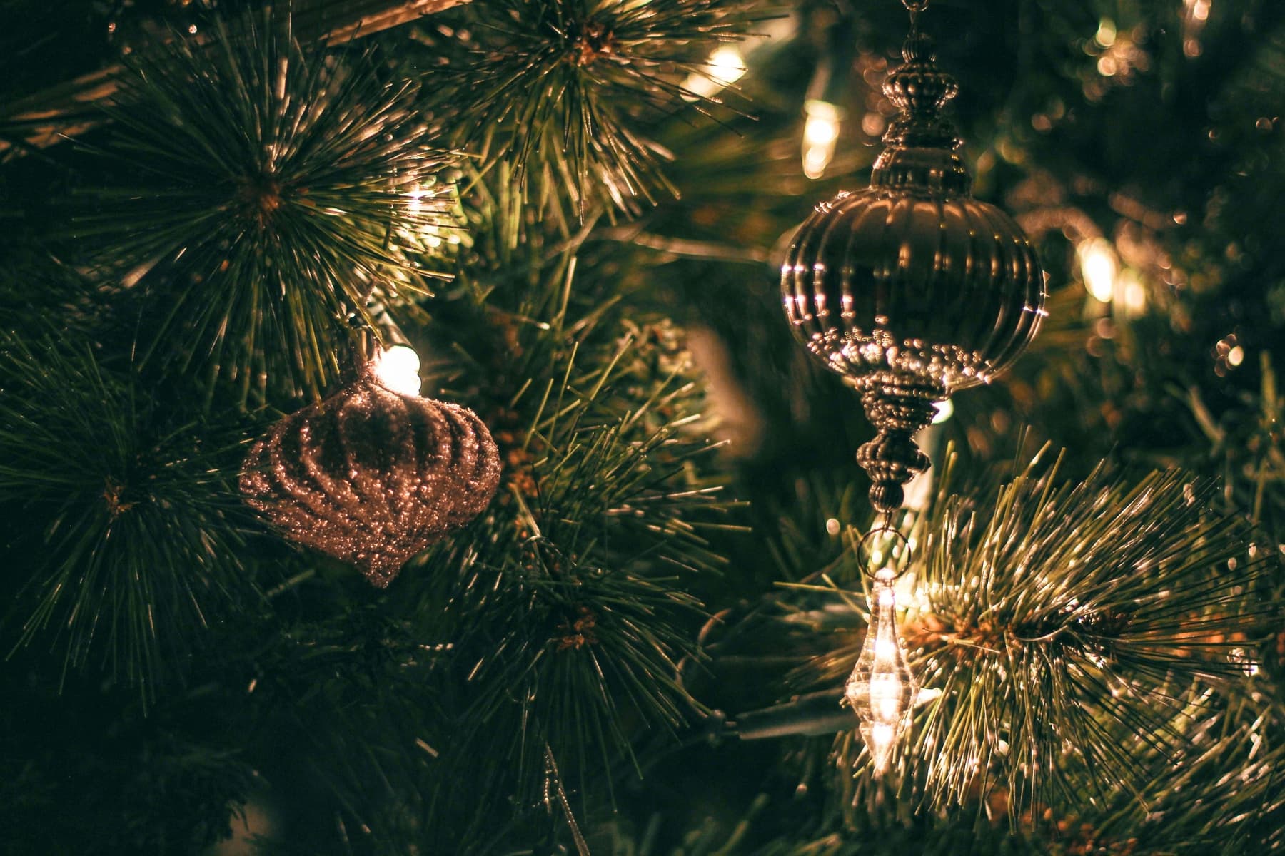
Similar colours can connect different shapes. The squat glittered form and the longer ribbed outline in Tom Swinnen’s photograph look related among the needles. Giving each outline some clear background lets the difference show.
Let the ornament settle before judging the position. Check the branch beneath it as well as the decorations to either side. A pointed drop needs a gap of a different shape from a round bauble; moving it to another branch may do more than adding a second one.
For a candle effect, choose a flameless light suited to its intended position. London Fire Brigade advises keeping decorations away from naked flames.
Look again with the room lights on, then with your usual tree lights. Reflections can draw attention to a smooth bauble while a darker shape recedes. The arrangement need not be equally full from every angle.
An unused bauble can stay in the box.