Words Hoard & Heath
Photography Đào Việt Hoàng, Irena Oze and Nguyen Tony
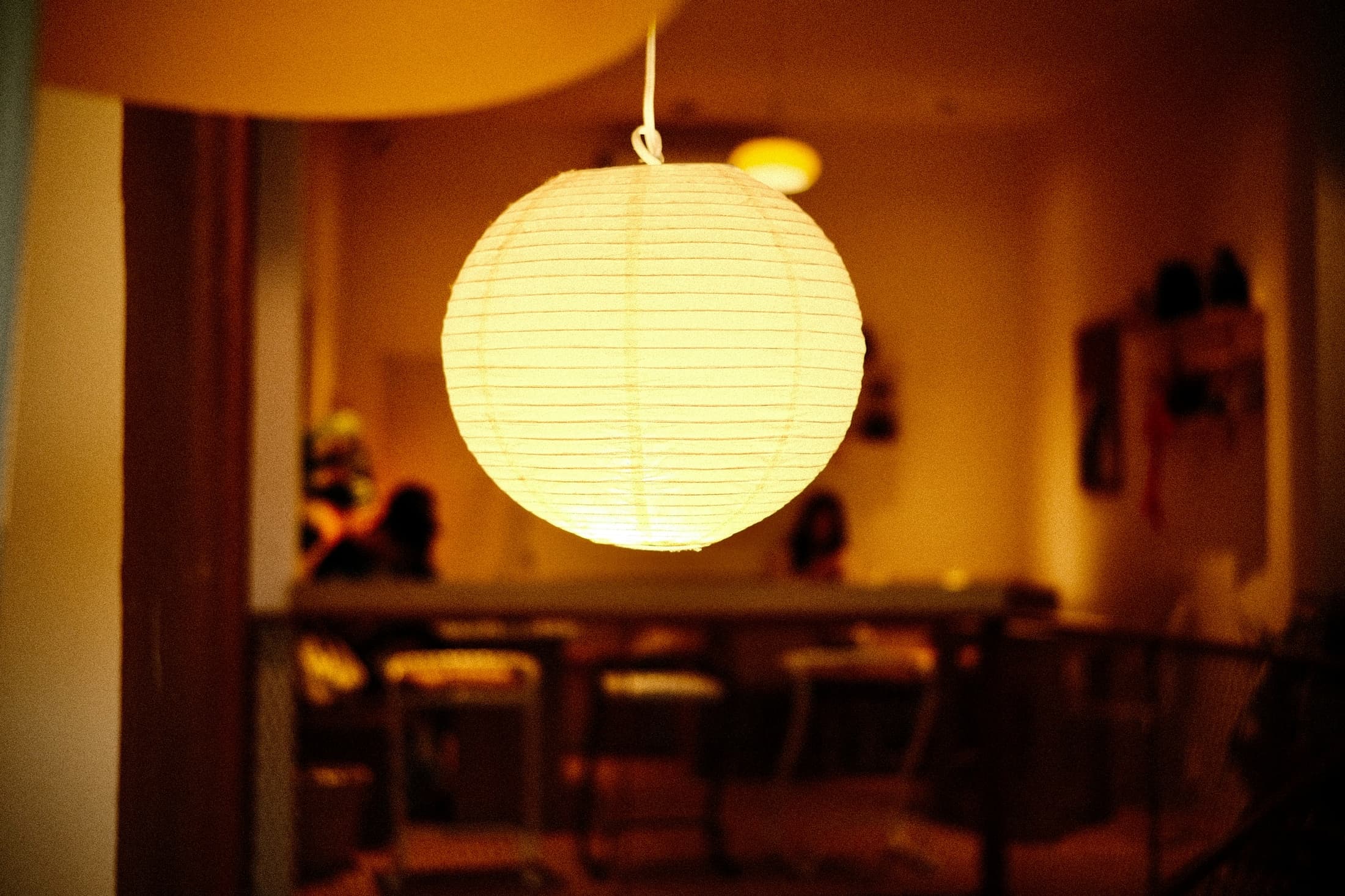
The ribs are the first thing to see. Thin lines circle the glowing shade in Đào Việt Hoàng’s photograph, while the room behind it falls out of focus. It is an appealing portrait of a light, but it leaves a practical question unanswered: how much of the room will that pale ball occupy?
A shape in daylight
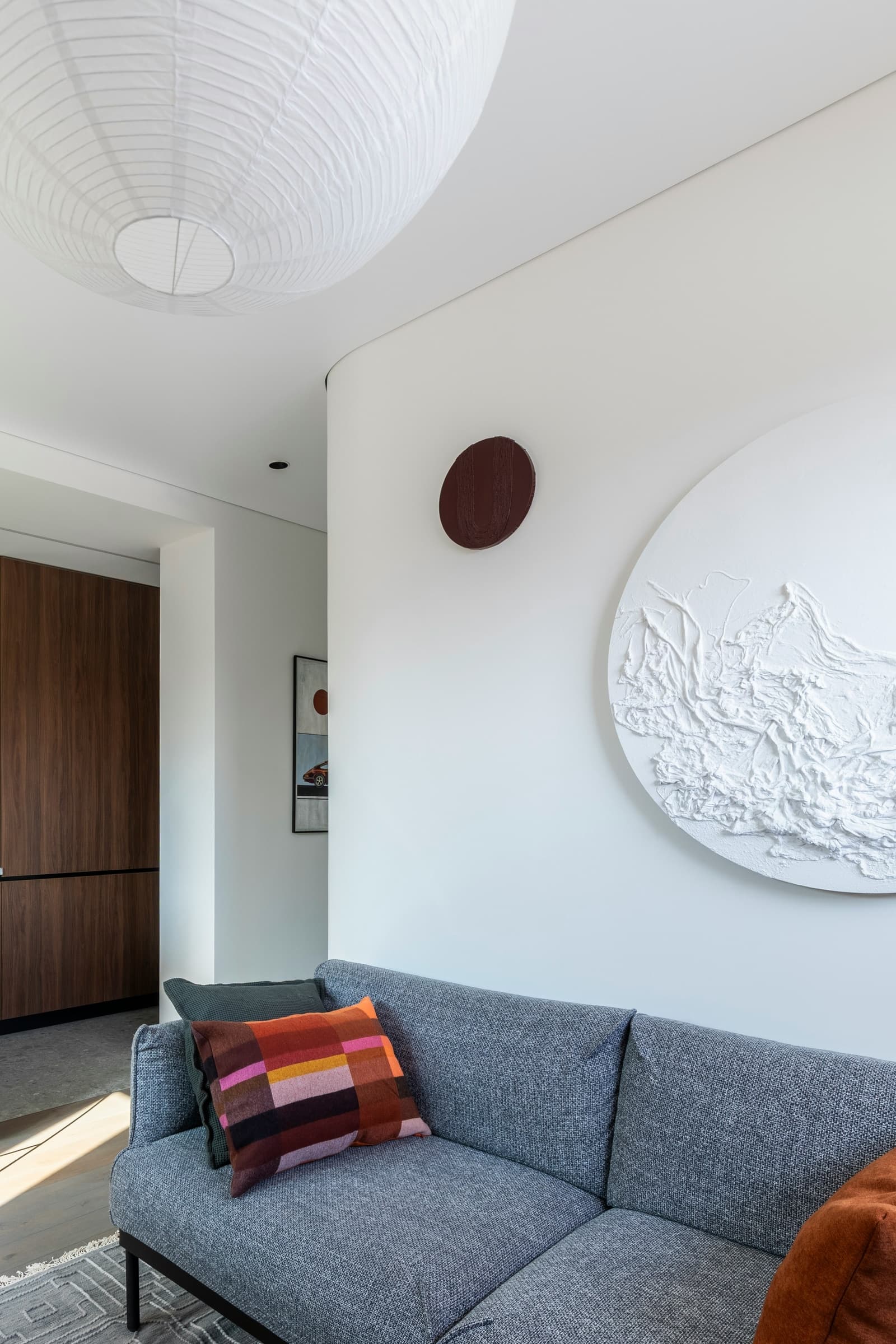
In Irena Oze’s photograph, the white shade shares its colour with the ceiling and the large circular relief on the wall. The striped cushion supplies the sharper colour. We like that restraint: a prominent shape overhead does not need to introduce another colour to the room. The shade fills the foreground, though, so its apparent size is no guide to the diameter you need.
Write down the shade’s width and depth as well as the available drop. A broad, shallow form occupies a different part of the view from a sphere of the same width. Compare those dimensions with the ceiling height and the furniture below, then look from the doorway and from your usual seat. A globe can sit comfortably against a blank ceiling in one view and cut across a picture in another.
Give it a place
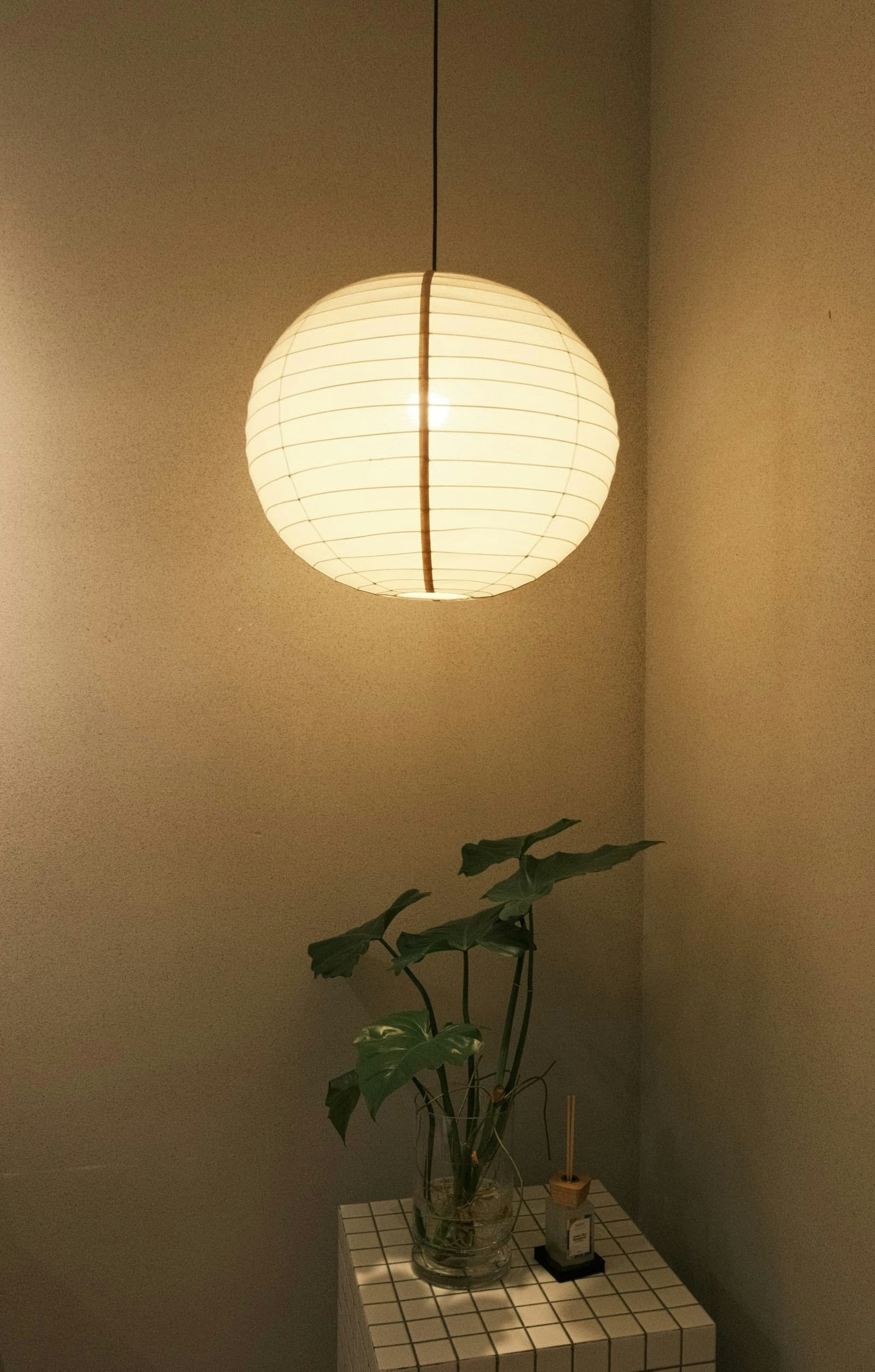
The corner in Nguyen Tony’s photograph has a clear centre: a single shade above a tiled table. Below it, leaves rise from a glass vessel. A gap keeps their irregular edges separate from the globe, and the plain walls leave its circle easy to read.
A pendant over a side table and one over a route through the room have different demands on their space. Work out where people stand, pass and lean before choosing the drop. Include the shade itself in that check, not just the length of cord. If the table is likely to move, consider what will be left underneath the light.
For a dining position, look across the table from the chairs. IKEA’s dining-lighting guidance stresses keeping sightlines clear and checking the light from a seated position. The useful test is whether you can see the person opposite without looking round the shade; the height that suits a particular directional pendant is not a universal instruction for a paper globe.
See it switched on
The paper becomes part of the light when the shade is illuminated. IKEA distinguishes a translucent shade, which spreads light into the room, from a solid shade that directs it downwards. That difference matters if you are choosing a light for a surface: an attractive glowing ball does not by itself establish how well you will see a book or a meal beneath it.
Ask to see the chosen shade lit as well as unlit. In the close view, the illuminated ribs are clear and the surrounding room is much darker; in the corner, the globe and wall both appear warm. These are separate photographs, not a comparison of bulbs. A warm-looking image cannot tell you the lamp’s brightness or colour temperature.
Check the shade’s specified fitting and the compatible cord set and bulb before buying, following the manufacturer’s instructions for that combination. Then return to the view from the chair. The pale shape you choose in daylight will also be a bright object in that view after dark.