Words Hoard & Heath
Photography Maria Orlova
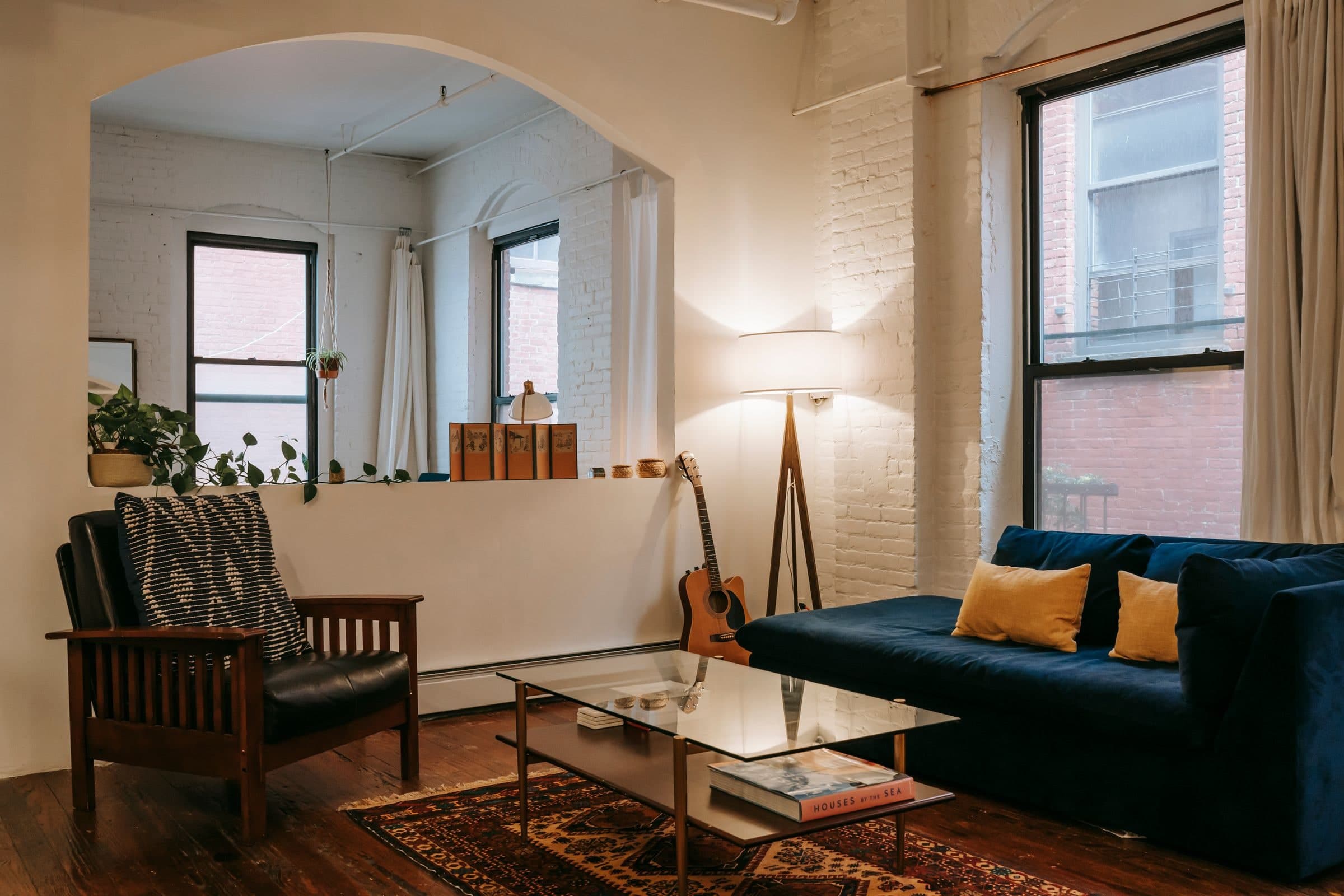
The floor gets the first say. Around the blue chair in Maria Orlova’s photograph, reddish tiles meet a white wall, with a woven basket and a pale lamp beside the window. A warmer wall colour would have to work with those tiles. ‘Warm white’ is a useful place to start looking; it is too broad a description to settle the choice.
If the floor is staying, take it seriously before opening a paint chart. The same goes for a sofa you are keeping or curtains already made. Hold possible colours beside those materials. A shade you like on its own may be less appealing against a yellowish fabric, or more interesting beside dark timber. The question is what you want to see together.
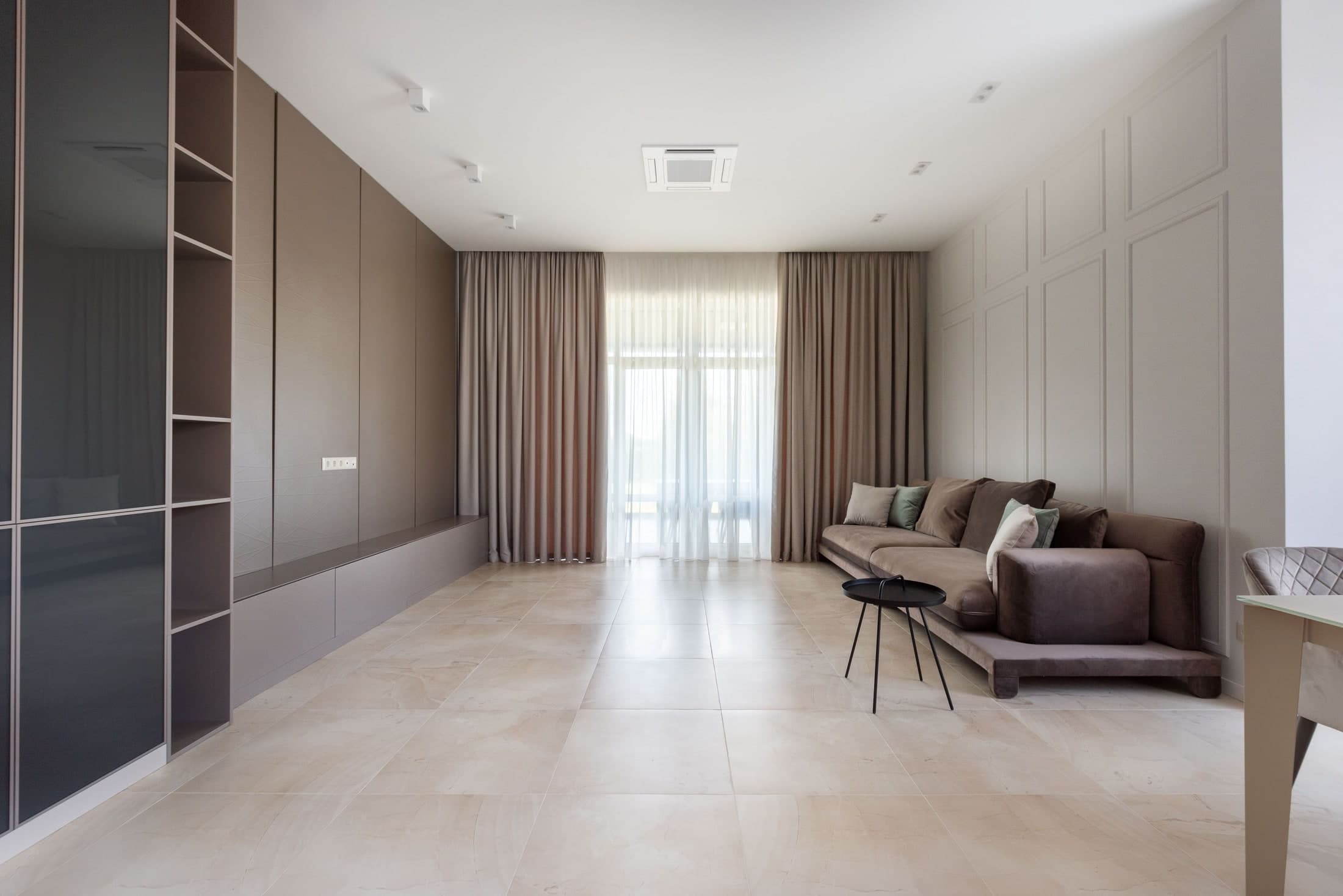
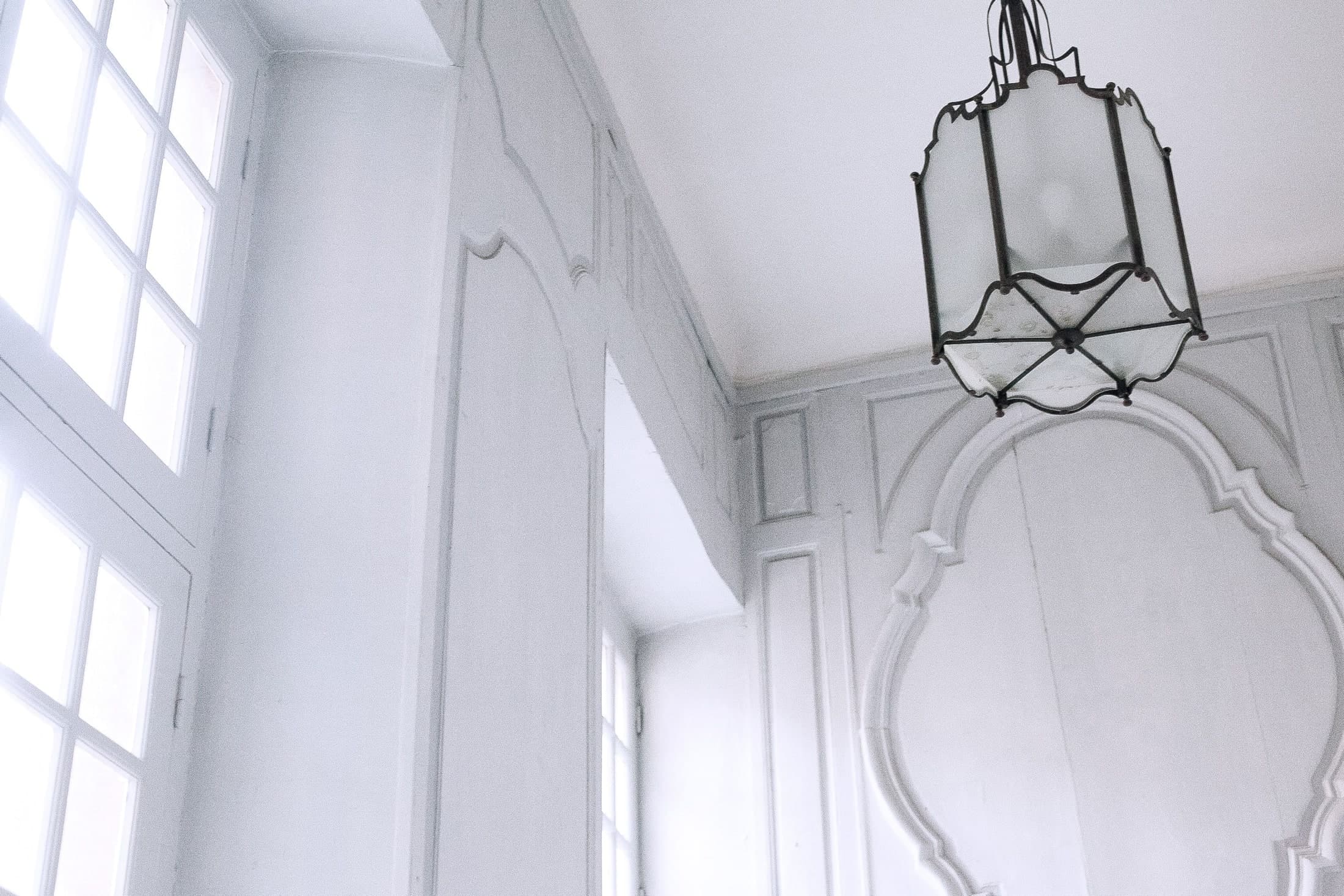
An empty room can make this seem simpler than it is. The white mouldings and window frames in the architectural photograph have almost no other colour around them; their shadows supply much of the detail. Add a rug, upholstery and a table, and there will be more relationships to judge. Bring a sample of the planned fabric into the room rather than choosing the wall in isolation.

Which kind of warmth?
Warm whites are a family, not a single colour. Little Greene groups whites with yellow or umber separately from those with pink. Its White Lead belongs to the yellow-based group; China Clay has a pink tinge. Those are useful alternatives to sample, rather than two interchangeable answers to a cold room.
A yellowish white may be exactly what you enjoy alongside a brown floor. If you want less cream, try a pinkish white as well. Keep the comparison small enough that you can describe the difference. ‘This one looks too yellow against the curtain’ is a better reason to discard a sample than its position on somebody else’s favourites list.
There is room for disagreement here. Eleanor Cording-Booth’s collection of expert white-paint choices for House & Garden includes designers who prefer different underlying colours, even when discussing similar rooms. Their named examples make a useful shortlist. They cannot settle how a paint will look alongside your own furniture.
Move the sample
Little Greene’s sampling guide recommends painting two coats onto A3 or A4 card or lining paper, allowing the first to dry before applying the second. A movable sample lets you try the colour on several walls, in brighter positions and in shade.
Give each shade a separate turn. The manufacturer advises against placing little swatches immediately beside one another, where each can change how its neighbour reads. Move the card near the floor, then beside the curtain or sofa. Include the existing woodwork if it is staying white; the wall colour will have to share the room with that too.
Write the colour name on the back before the cards become indistinguishable. Keep only the candidates that still appeal when you move them away from the bright window.
Stay for the evening
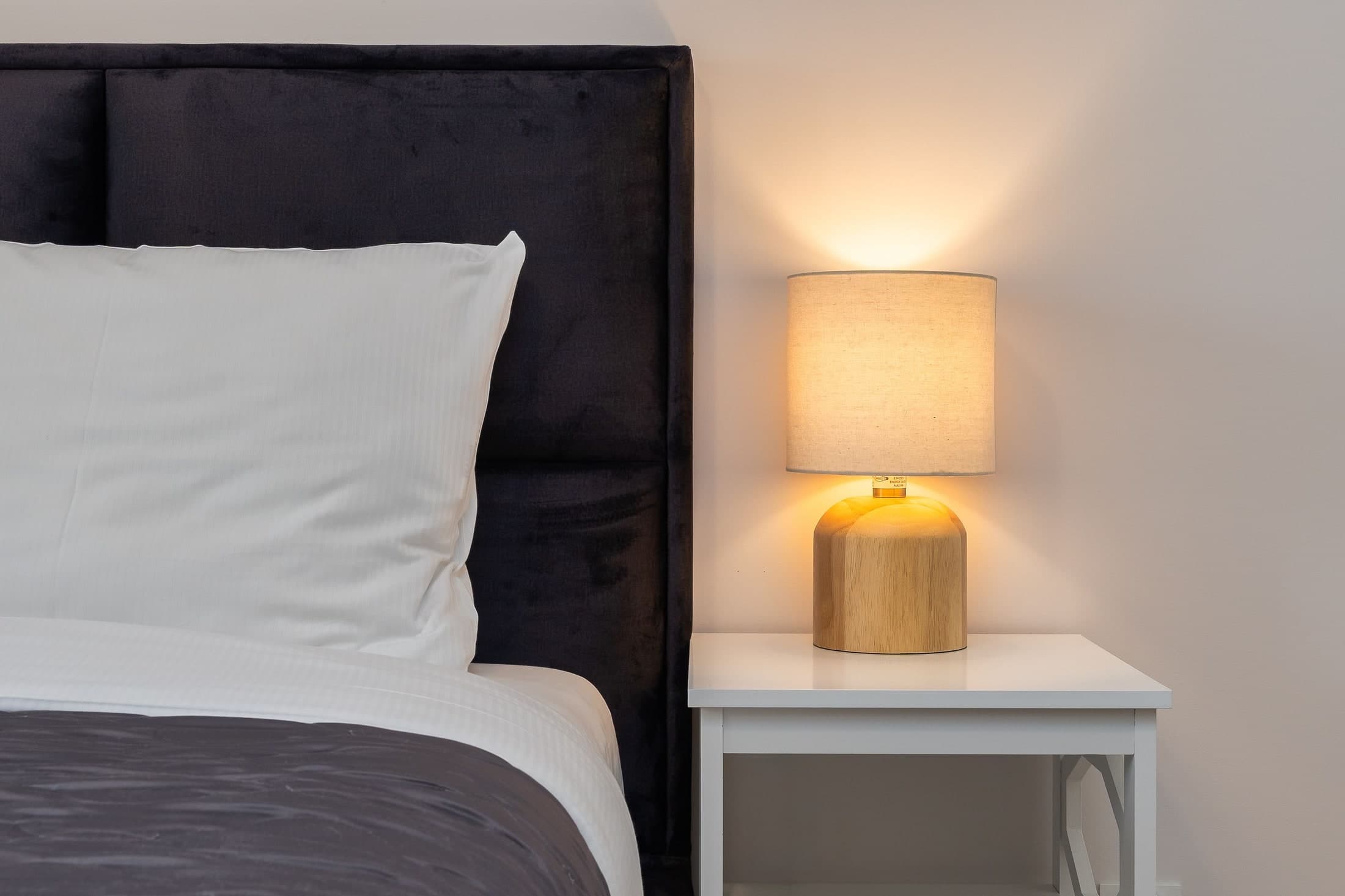
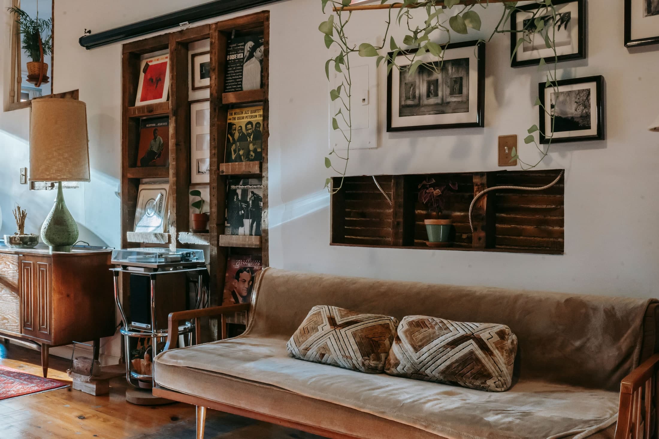
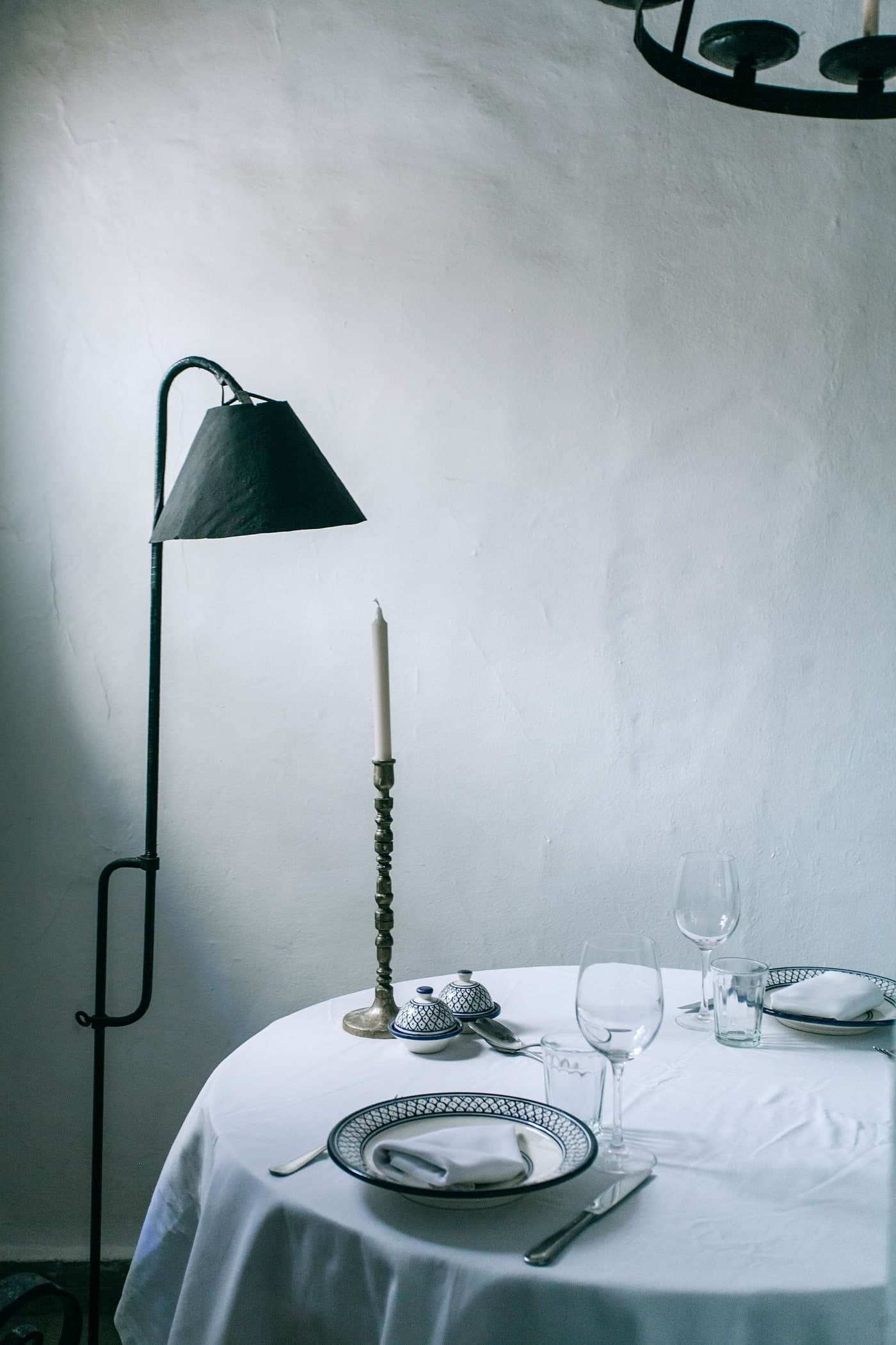
Natural and artificial light can change how a colour appears. Little Greene advises viewing samples with the lights both on and off, at different times of day. A shaded dining wall deserves a test of its own. Around Orlova’s set table, the pale cloth, wall texture and dark lamp make quite a different grouping from the bright mouldings. Neither photograph identifies a paint shade.
If you mostly use the room after dark, let that view carry more weight. There is no obligation to keep the sample that looked nicest by the window at noon. Leave the final card on the wall opposite your usual seat and look at it with the lamps on.